Aliquam

Task 1: Short biography written using markdown
The Biography of Jiangxia Yu
Jiangxia was born on 23rd October 1996. He was named after two provinces in China, ZheJiang and NingXia, one for his parents’ hometown and one for his birthplace.
After enrolled in UCL for his undergraduate degree, Jiangxia decides to name himself Rory because he had seen so many non-Mandarin speakers having trouble pronouncing his Chinese name. During his time in UCL, Rory had courses in:
Economics
Econometrics
Programming

After graduating from UCL, Rory decided to take a gap year because of the pandemic. During the gap year, Rory worked on two internships in one security company and one Big 4 consultancy. More details can be found on Rory’s LinkedIn page.
Task 2: gapminder country comparison
glimpse(gapminder)## Rows: 1,704
## Columns: 6
## $ country <fct> "Afghanistan", "Afghanistan", "Afghanistan", "Afghanistan", ~
## $ continent <fct> Asia, Asia, Asia, Asia, Asia, Asia, Asia, Asia, Asia, Asia, ~
## $ year <int> 1952, 1957, 1962, 1967, 1972, 1977, 1982, 1987, 1992, 1997, ~
## $ lifeExp <dbl> 28.801, 30.332, 31.997, 34.020, 36.088, 38.438, 39.854, 40.8~
## $ pop <int> 8425333, 9240934, 10267083, 11537966, 13079460, 14880372, 12~
## $ gdpPercap <dbl> 779.4453, 820.8530, 853.1007, 836.1971, 739.9811, 786.1134, ~head(gapminder, 20) # look at the first 20 rows of the dataframe## # A tibble: 20 x 6
## country continent year lifeExp pop gdpPercap
## <fct> <fct> <int> <dbl> <int> <dbl>
## 1 Afghanistan Asia 1952 28.8 8425333 779.
## 2 Afghanistan Asia 1957 30.3 9240934 821.
## 3 Afghanistan Asia 1962 32.0 10267083 853.
## 4 Afghanistan Asia 1967 34.0 11537966 836.
## 5 Afghanistan Asia 1972 36.1 13079460 740.
## 6 Afghanistan Asia 1977 38.4 14880372 786.
## 7 Afghanistan Asia 1982 39.9 12881816 978.
## 8 Afghanistan Asia 1987 40.8 13867957 852.
## 9 Afghanistan Asia 1992 41.7 16317921 649.
## 10 Afghanistan Asia 1997 41.8 22227415 635.
## 11 Afghanistan Asia 2002 42.1 25268405 727.
## 12 Afghanistan Asia 2007 43.8 31889923 975.
## 13 Albania Europe 1952 55.2 1282697 1601.
## 14 Albania Europe 1957 59.3 1476505 1942.
## 15 Albania Europe 1962 64.8 1728137 2313.
## 16 Albania Europe 1967 66.2 1984060 2760.
## 17 Albania Europe 1972 67.7 2263554 3313.
## 18 Albania Europe 1977 68.9 2509048 3533.
## 19 Albania Europe 1982 70.4 2780097 3631.
## 20 Albania Europe 1987 72 3075321 3739.country_data <- gapminder %>%
filter(country == "China")
continent_data <- gapminder %>%
filter(continent == "Asia") library(ggplot2)
plot1 <- ggplot(data = country_data, mapping = aes(x = year, y = lifeExp))+
geom_point()+
geom_smooth(se = FALSE)+
NULL
plot1## `geom_smooth()` using method = 'loess' and formula 'y ~ x'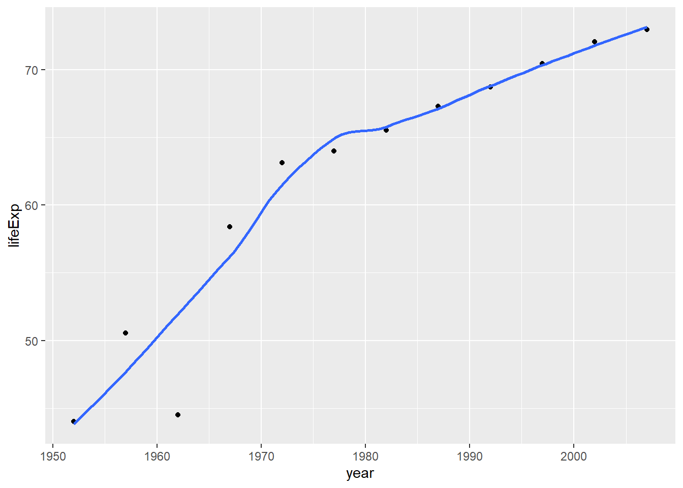
 plot1<- plot1 +
   labs(title = "Life Expectancy of China ",
       x = "Year",
       y = "Life Expectancy") +
   NULL


 plot1
## `geom_smooth()` using method = 'loess' and formula 'y ~ x'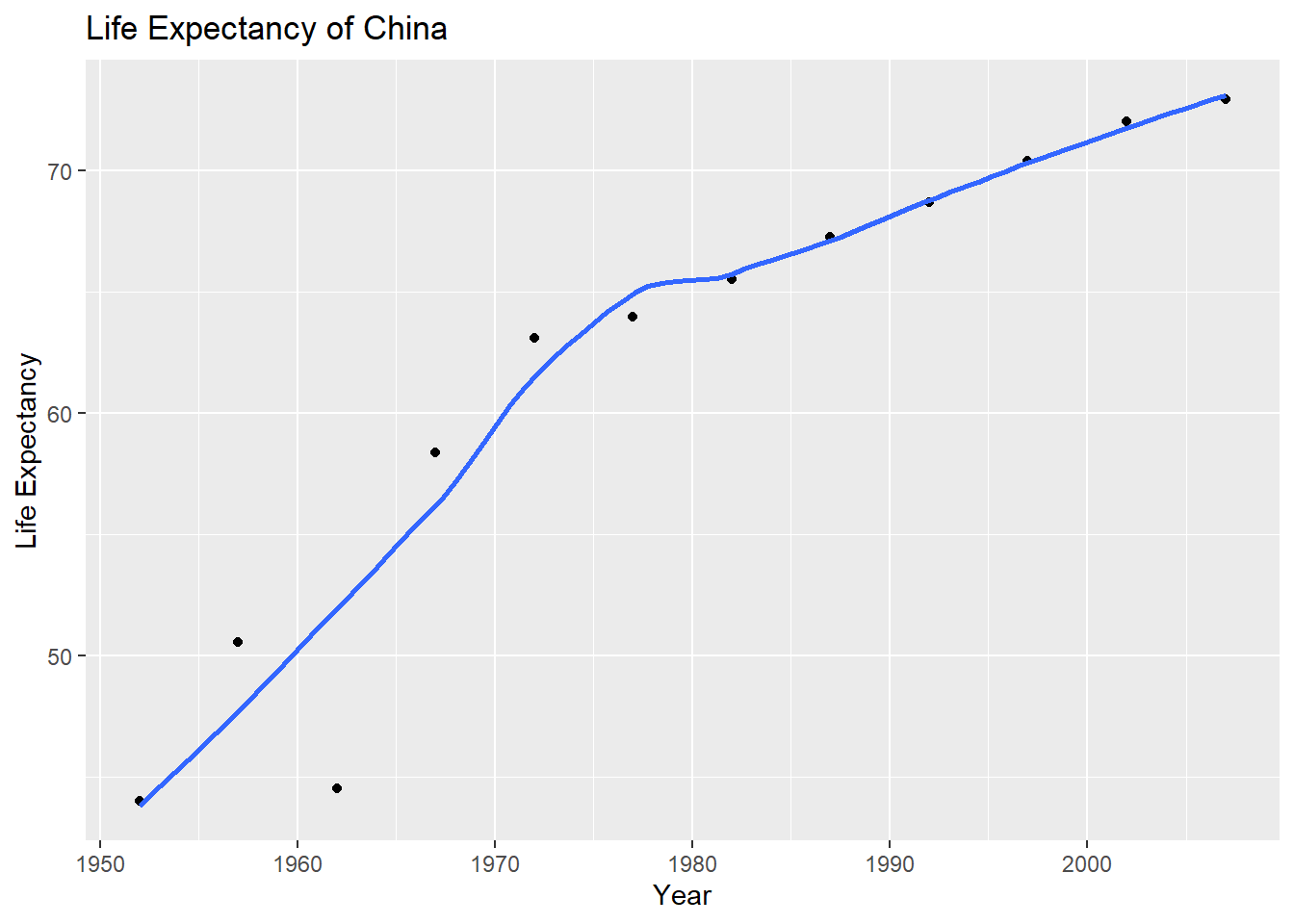
 plot2 <- ggplot(data = continent_data, mapping = aes(x = year , y = lifeExp, colour = country, group = country)) +
   geom_point() +
   geom_smooth(se = FALSE) +
   labs(title = "Life Expectancy of Asian countries ",
       x = "Year",
       y = "Life Expectancy") +
   NULL

 plot2
## `geom_smooth()` using method = 'loess' and formula 'y ~ x'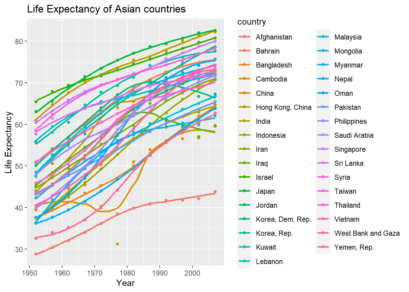
 plot3 <- ggplot(data = gapminder , mapping = aes(x = year , y =  lifeExp, colour= continent))+
   geom_point() +
   geom_smooth(se = FALSE) +
   facet_wrap(~continent) +
   theme(legend.position="none") +
   labs(title = "Life Expectancy of Continents",
       x = "Year",
       y = "Life Expectancy") +
   NULL

 plot3
## `geom_smooth()` using method = 'loess' and formula 'y ~ x'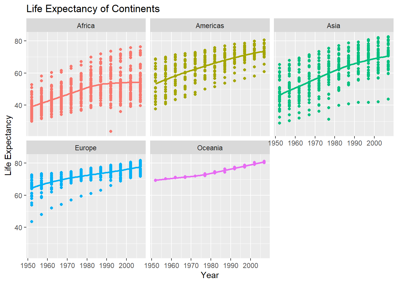
Given these trends, what can you say about life expectancy since 1952? Again, don’t just say what’s happening in the graph. Tell some sort of story and speculate about the differences in the patterns.
Type your answer after this blockquote.
Generally, the life expectancy around the world has been increasing since 1952. However, different continents demonstrated different trends.
For more developed continents such as Europe and Oceania, the life expectancy starts with rather high ages over 60s. Over the past years, their life expectancy has slowly grown to 80s. Such trends can be largely attributed to their better-developed national healthcare systems. Regarding the variability across countries, it is also decreasing over the years. This is probably because of the establishment of European Union.
For Americas and Asia, both continents had experienced huge increases in life expectancy. This is mainly because both continents have seen huge growth in country’s wealth and infrastructure developments. As urbanization and globalization take place, their life expectancy gradually catch up to that of Europe and Oceania. Particularly, for many Asian countries, the aftermath of World War 2 and the limited resources were the main reason why their life expectancy was so low to begin with. It is evident that most American countries have less and less variation in life expectancy. But Asian countries do not share this decrease in variation probably because of the unbalanced development status within Asia.
For Africa, the least-developed healthcare system and limited natural resources are the main reasons why their life expectancy still fall behind the world trend. Most countries in Africa lack the essential resources, capital and technology to help increase the life expectancy of its people. Moreover, the variation in countries is actually increasing over the years. This also illustrates the unbalanced development within the continent.
Task 3: Brexit vote analysis
We will have a look at the results of the 2016 Brexit vote in the UK. First we read the data using read_csv() and have a quick glimpse at the data
brexit_results <- read_csv(here::here("data","brexit_results.csv"))

glimpse(brexit_results)
## Rows: 632
## Columns: 11
## $ Seat <chr> "Aldershot", "Aldridge-Brownhills", "Altrincham and Sale W~
## $ con_2015 <dbl> 50.592, 52.050, 52.994, 43.979, 60.788, 22.418, 52.454, 22~
## $ lab_2015 <dbl> 18.333, 22.369, 26.686, 34.781, 11.197, 41.022, 18.441, 49~
## $ ld_2015 <dbl> 8.824, 3.367, 8.383, 2.975, 7.192, 14.828, 5.984, 2.423, 1~
## $ ukip_2015 <dbl> 17.867, 19.624, 8.011, 15.887, 14.438, 21.409, 18.821, 21.~
## $ leave_share <dbl> 57.89777, 67.79635, 38.58780, 65.29912, 49.70111, 70.47289~
## $ born_in_uk <dbl> 83.10464, 96.12207, 90.48566, 97.30437, 93.33793, 96.96214~
## $ male <dbl> 49.89896, 48.92951, 48.90621, 49.21657, 48.00189, 49.17185~
## $ unemployed <dbl> 3.637000, 4.553607, 3.039963, 4.261173, 2.468100, 4.742731~
## $ degree <dbl> 13.870661, 9.974114, 28.600135, 9.336294, 18.775591, 6.085~
## $ age_18to24 <dbl> 9.406093, 7.325850, 6.437453, 7.747801, 5.734730, 8.209863~To get a sense of the spread, or distribution, of the data, we can plot a histogram, a density plot, and the empirical cumulative distribution function of the leave % in all constituencies.
# histogram
ggplot(brexit_results, aes(x = leave_share)) +
  geom_histogram(binwidth = 2.5) +
  labs(title = "Brexit results",
      subtitle = "histogram",
      x = "Leave share",
      y = "Count") +
  NULL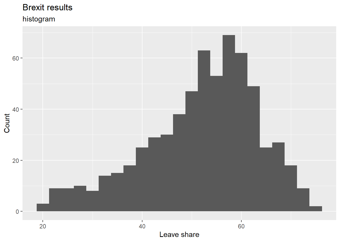
# density plot
ggplot(brexit_results, aes(x = leave_share)) +
  geom_density() +
  labs(title = "Brexit results",
      subtitle = "density plot",
      x = "Leave share",
      y = "Density") +
  NULL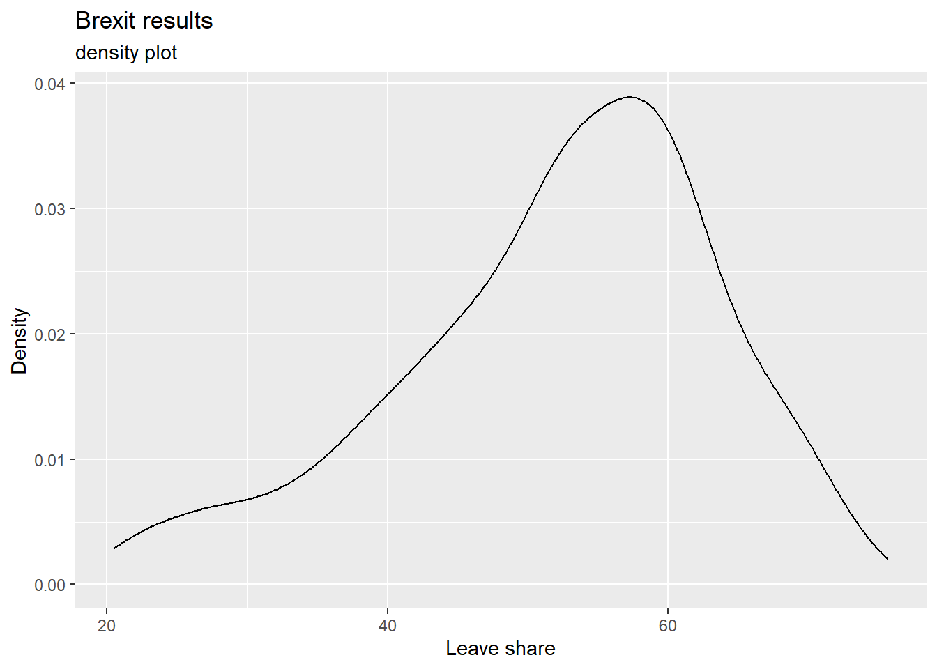
# The empirical cumulative distribution function (ECDF)
ggplot(brexit_results, aes(x = leave_share)) +
  stat_ecdf(geom = "step", pad = FALSE) +
  scale_y_continuous(labels = scales::percent) +
  labs(title = "Brexit results",
      subtitle = "empirical cumulative distribution function (ECDF)",
      x = "Leave share",
      y = "Cumulative probability") +
  NULL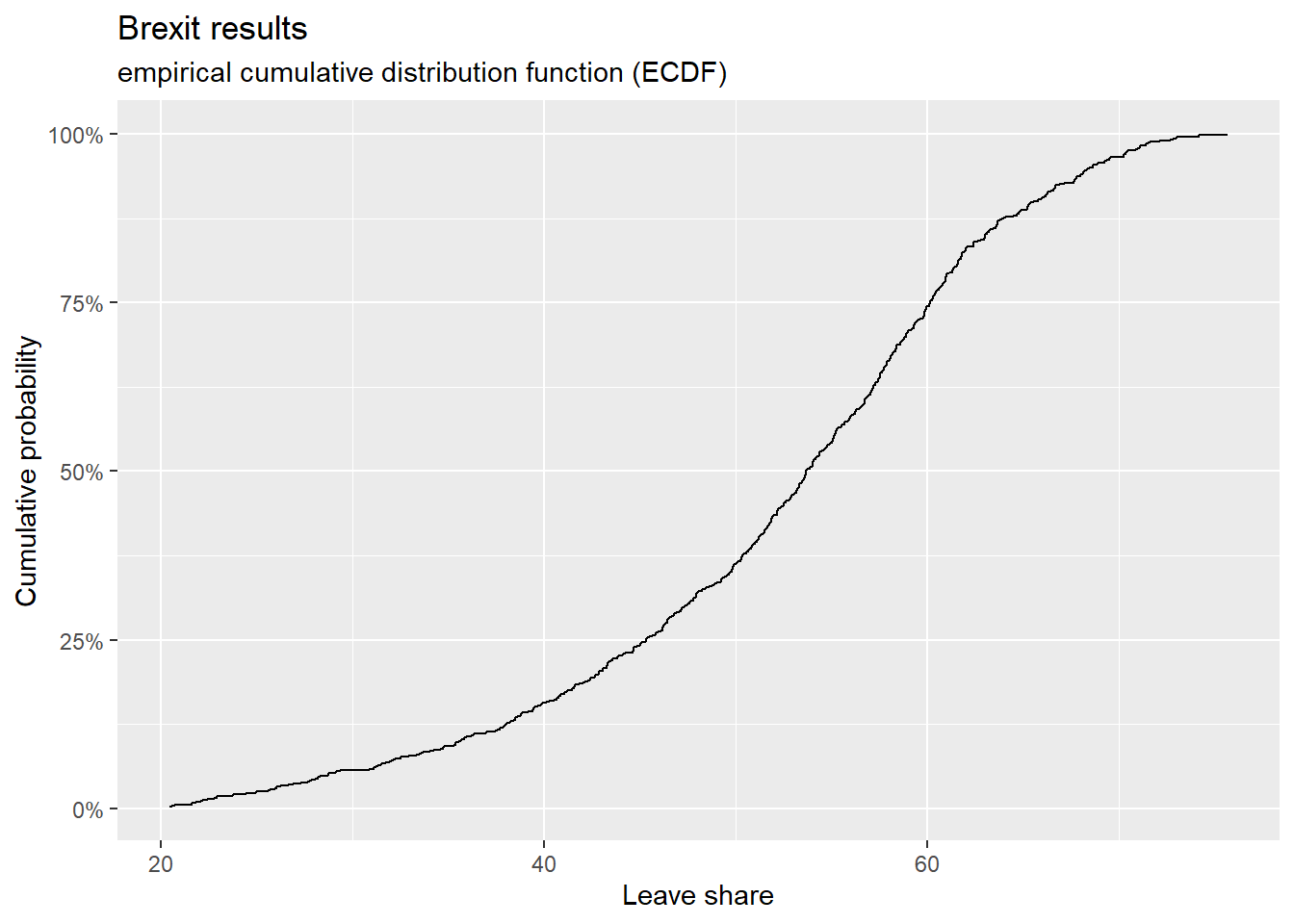
brexit_results %>%
  select(leave_share, born_in_uk) %>%
  cor()
## leave_share born_in_uk
## leave_share 1.0000000 0.4934295
## born_in_uk 0.4934295 1.0000000The correlation is almost 0.5, which shows that the two variables are positively correlated.
library(ggplot2)
ggplot(brexit_results, aes(x = born_in_uk, y = leave_share)) +
  geom_point(alpha=0.3) +

  # add a smoothing line, and use method="lm" to get the best straight-line
  geom_smooth(method = "lm") +

  # use a white background and frame the plot with a black box
  theme_bw() +

  labs(title = "Correlation between native born residents and leave share",
    subtitle = "scatter plot with the best fitting line",
    x = "Proportion of native born residents",
    y = "Leave share") +

  NULL
## `geom_smooth()` using formula 'y ~ x'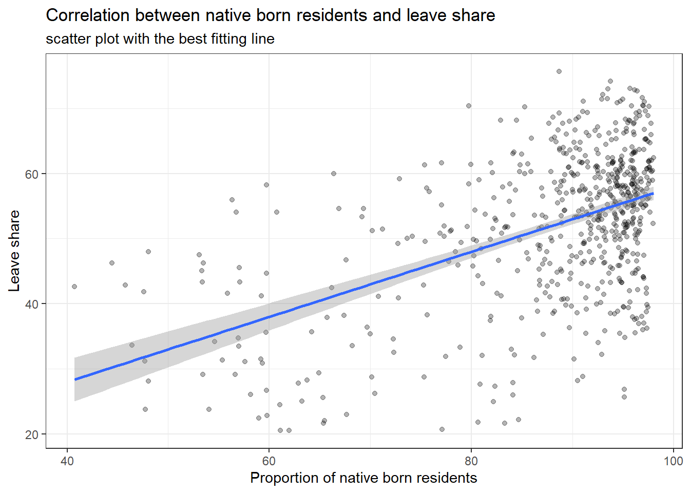
What can you say about the relationship shown above? Again, don’t just say what’s happening in the graph. Tell some sort of story and speculate about the differences in the patterns.
Type your answer after, and outside, this blockquote.
The positive correlation between leave share and porportion of native born residents means that with higher proportion of residents being native born, a constituent would have higher leave share.
This trend could be explained by the demographic characteristics of immigrants and their jobs. Most immigrants from Europe would be less educated with lower income prospects. They would come to UK for jobs that pay less and therefore directly compete with British also looking for those jobs. Therefore, with more competition from immigrants, the regions with higher native born residents would naturally have much higher competition in job market and more native residents losing their jobs because of the immigrants’ competition. Such natives would naturally vote to leave European Union in order to restore their competitiveness in local job market.
On the other hand, another reason for this positive correlation could be the perceptions towards immigrants in local constituents. In constituents with less native born proportion, the residents would have much diverse backgrounds and therefore have more tolerance regarding immigrants. However, in constituents with higher native born proportion, they have less opportunities interacting with or even encountering immigrants. Thus, their perceptions would naturally be negative about immigrants, which then results in higher leave share.
Task 4: Animal rescue incidents attended by the London Fire Brigade
url <- "https://data.london.gov.uk/download/animal-rescue-incidents-attended-by-lfb/8a7d91c2-9aec-4bde-937a-3998f4717cd8/Animal%20Rescue%20incidents%20attended%20by%20LFB%20from%20Jan%202009.csv"

animal_rescue <- read_csv(url,
                          locale = locale(encoding = "CP1252")) %>%
  janitor::clean_names()

glimpse(animal_rescue)
## Rows: 7,772
## Columns: 31
## $ incident_number <chr> "139091", "275091", "2075091", "2872091"~
## $ date_time_of_call <chr> "01/01/2009 03:01", "01/01/2009 08:51", ~
## $ cal_year <dbl> 2009, 2009, 2009, 2009, 2009, 2009, 2009~
## $ fin_year <chr> "2008/09", "2008/09", "2008/09", "2008/0~
## $ type_of_incident <chr> "Special Service", "Special Service", "S~
## $ pump_count <chr> "1", "1", "1", "1", "1", "1", "1", "1", ~
## $ pump_hours_total <chr> "2", "1", "1", "1", "1", "1", "1", "1", ~
## $ hourly_notional_cost <dbl> 255, 255, 255, 255, 255, 255, 255, 255, ~
## $ incident_notional_cost <chr> "510", "255", "255", "255", "255", "255"~
## $ final_description <chr> "Redacted", "Redacted", "Redacted", "Red~
## $ animal_group_parent <chr> "Dog", "Fox", "Dog", "Horse", "Rabbit", ~
## $ originof_call <chr> "Person (land line)", "Person (land line~
## $ property_type <chr> "House - single occupancy", "Railings", ~
## $ property_category <chr> "Dwelling", "Outdoor Structure", "Outdoo~
## $ special_service_type_category <chr> "Other animal assistance", "Other animal~
## $ special_service_type <chr> "Animal assistance involving livestock -~
## $ ward_code <chr> "E05011467", "E05000169", "E05000558", "~
## $ ward <chr> "Crystal Palace & Upper Norwood", "Woods~
## $ borough_code <chr> "E09000008", "E09000008", "E09000029", "~
## $ borough <chr> "Croydon", "Croydon", "Sutton", "Hilling~
## $ stn_ground_name <chr> "Norbury", "Woodside", "Wallington", "Ru~
## $ uprn <chr> "NULL", "NULL", "NULL", "100021491149", ~
## $ street <chr> "Waddington Way", "Grasmere Road", "Mill~
## $ usrn <chr> "20500146", "NULL", "NULL", "21401484", ~
## $ postcode_district <chr> "SE19", "SE25", "SM5", "UB9", "RM3", "RM~
## $ easting_m <chr> "NULL", "534785", "528041", "504689", "N~
## $ northing_m <chr> "NULL", "167546", "164923", "190685", "N~
## $ easting_rounded <dbl> 532350, 534750, 528050, 504650, 554650, ~
## $ northing_rounded <dbl> 170050, 167550, 164950, 190650, 192350, ~
## $ latitude <chr> "NULL", "51.39095371", "51.36894086", "5~
## $ longitude <chr> "NULL", "-0.064166887", "-0.161985191", ~animal_rescue %>%
dplyr::group_by(cal_year) %>%
summarise(count=n())## # A tibble: 13 x 2
## cal_year count
## <dbl> <int>
## 1 2009 568
## 2 2010 611
## 3 2011 620
## 4 2012 603
## 5 2013 585
## 6 2014 583
## 7 2015 540
## 8 2016 604
## 9 2017 539
## 10 2018 610
## 11 2019 604
## 12 2020 758
## 13 2021 547animal_rescue %>%
count(cal_year, name="count")## # A tibble: 13 x 2
## cal_year count
## <dbl> <int>
## 1 2009 568
## 2 2010 611
## 3 2011 620
## 4 2012 603
## 5 2013 585
## 6 2014 583
## 7 2015 540
## 8 2016 604
## 9 2017 539
## 10 2018 610
## 11 2019 604
## 12 2020 758
## 13 2021 547animal_rescue %>%
group_by(animal_group_parent) %>%
#group_by and summarise will produce a new column with the count in each animal group
summarise(count = n()) %>%
# mutate adds a new column; here we calculate the percentage
mutate(percent = round(100*count/sum(count),2)) %>%
# arrange() sorts the data by percent. Since the default sorting is min to max and we would like to see it sorted
# in descending order (max to min), we use arrange(desc())
arrange(desc(percent))## # A tibble: 28 x 3
## animal_group_parent count percent
## <chr> <int> <dbl>
## 1 Cat 3736 48.1
## 2 Bird 1611 20.7
## 3 Dog 1213 15.6
## 4 Fox 366 4.71
## 5 Unknown - Domestic Animal Or Pet 199 2.56
## 6 Horse 195 2.51
## 7 Deer 132 1.7
## 8 Unknown - Wild Animal 93 1.2
## 9 Squirrel 66 0.85
## 10 Unknown - Heavy Livestock Animal 50 0.64
## # ... with 18 more rowsanimal_rescue %>%
#count does the same thing as group_by and summarise
# name = "count" will call the column with the counts "count" ( exciting, I know)
# and 'sort=TRUE' will sort them from max to min
count(animal_group_parent, name="count", sort=TRUE) %>%
mutate(percent = round(100*count/sum(count),2))## # A tibble: 28 x 3
## animal_group_parent count percent
## <chr> <int> <dbl>
## 1 Cat 3736 48.1
## 2 Bird 1611 20.7
## 3 Dog 1213 15.6
## 4 Fox 366 4.71
## 5 Unknown - Domestic Animal Or Pet 199 2.56
## 6 Horse 195 2.51
## 7 Deer 132 1.7
## 8 Unknown - Wild Animal 93 1.2
## 9 Squirrel 66 0.85
## 10 Unknown - Heavy Livestock Animal 50 0.64
## # ... with 18 more rowsDo you see anything strange in these tables?
The categories of such animal rescues are a little too specific. I can’t think of a reason why lamb and goat are categorised differently. In my opinion, they could be all categorised as sheep. The same reason applies to Cat and cat. I don’t know why such two cats would be different in category.
Please note that any cost included is a notional cost calculated based on the length of time rounded up to the nearest hour spent by Pump, Aerial and FRU appliances at the incident and charged at the current Brigade hourly rate.
There is two things we will do:
- Calculate the mean and median
incident_notional_costfor eachanimal_group_parent - Plot a boxplot to get a feel for the distribution of
incident_notional_costbyanimal_group_parent.
# what type is variable incident_notional_cost from dataframe `animal_rescue`
typeof(animal_rescue$incident_notional_cost)
## [1] "character"# readr::parse_number() will convert any numerical values stored as characters into numbers
animal_rescue <- animal_rescue %>%
# we use mutate() to use the parse_number() function and overwrite the same variable
mutate(incident_notional_cost = parse_number(incident_notional_cost))
# incident_notional_cost from dataframe `animal_rescue` is now 'double' or numeric
typeof(animal_rescue$incident_notional_cost)## [1] "double"animal_rescue %>%
# group by animal_group_parent
group_by(animal_group_parent) %>%
# filter resulting data, so each group has at least 6 observations
filter(n()>6) %>%
# summarise() will collapse all values into 3 values: the mean, median, and count
# we use na.rm=TRUE to make sure we remove any NAs, or cases where we do not have the incident cos
summarise(mean_incident_cost = mean (incident_notional_cost, na.rm=TRUE),
median_incident_cost = median (incident_notional_cost, na.rm=TRUE),
sd_incident_cost = sd (incident_notional_cost, na.rm=TRUE),
min_incident_cost = min (incident_notional_cost, na.rm=TRUE),
max_incident_cost = max (incident_notional_cost, na.rm=TRUE),
count = n()) %>%
# sort the resulting data in descending order. You choose whether to sort by count or mean cost.
arrange(desc(count))## # A tibble: 16 x 7
## animal_group_parent mean_incident_co~ median_incident_~ sd_incident_cost
## <chr> <dbl> <dbl> <dbl>
## 1 Cat 343. 298 160.
## 2 Bird 344. 328 135.
## 3 Dog 347. 298 169.
## 4 Fox 373. 328 206.
## 5 Unknown - Domestic Anim~ 326. 295 117.
## 6 Horse 740. 596 541.
## 7 Deer 417. 333 286.
## 8 Unknown - Wild Animal 416. 333 324.
## 9 Squirrel 313. 326 57.1
## 10 Unknown - Heavy Livesto~ 374. 260 263.
## 11 cat 324. 290 94.1
## 12 Hamster 315. 290 95.0
## 13 Snake 356. 339 105.
## 14 Rabbit 309. 326 32.2
## 15 Ferret 309. 333 39.4
## 16 Cow 634. 520 475.
## # ... with 3 more variables: min_incident_cost <dbl>, max_incident_cost <dbl>,
## # count <int>Compare the mean and the median for each animal group. what do you think this is telling us? Anything else that stands out? Any outliers?
From comparing the mean and medians, It is clearly that animals or pets that are small in size would have much lower costs in rescuing. Bother their mean and median are smaller than those of larger animals such as horse and cow. Moreover, across different small animals, the mean and median notional costs are similar. Both around 300. This is telling us probably, LFB have spend similar hours in rescuing such animals. In my guess, probably most incidents abour smaller animals would be solved within one hour so the cost associated with such smaller animals are usually around 300.
The only outlier would be Heavy livestock animal. Comparing this with other large animals such as horse and cow, the mean and median of rescuing heavy livestock animal is much smaller and even smaller than many of the pets. The median is even the smallest cross the whole group. Maybe this is because the owners of these livestock would only call for LFB help if the incident is rather smaller and easier to solve. If the incident is too serious, the owners might directly give up the livestock, assuming those livestock are cultivated for meat consumption.
# base_plot
base_plot <- animal_rescue %>%
  group_by(animal_group_parent) %>%
  filter(n()>6) %>%
  ggplot(aes(x=incident_notional_cost))+
  facet_wrap(~animal_group_parent, scales = "free")+
  theme_bw()

base_plot + geom_histogram(binwidth = 50)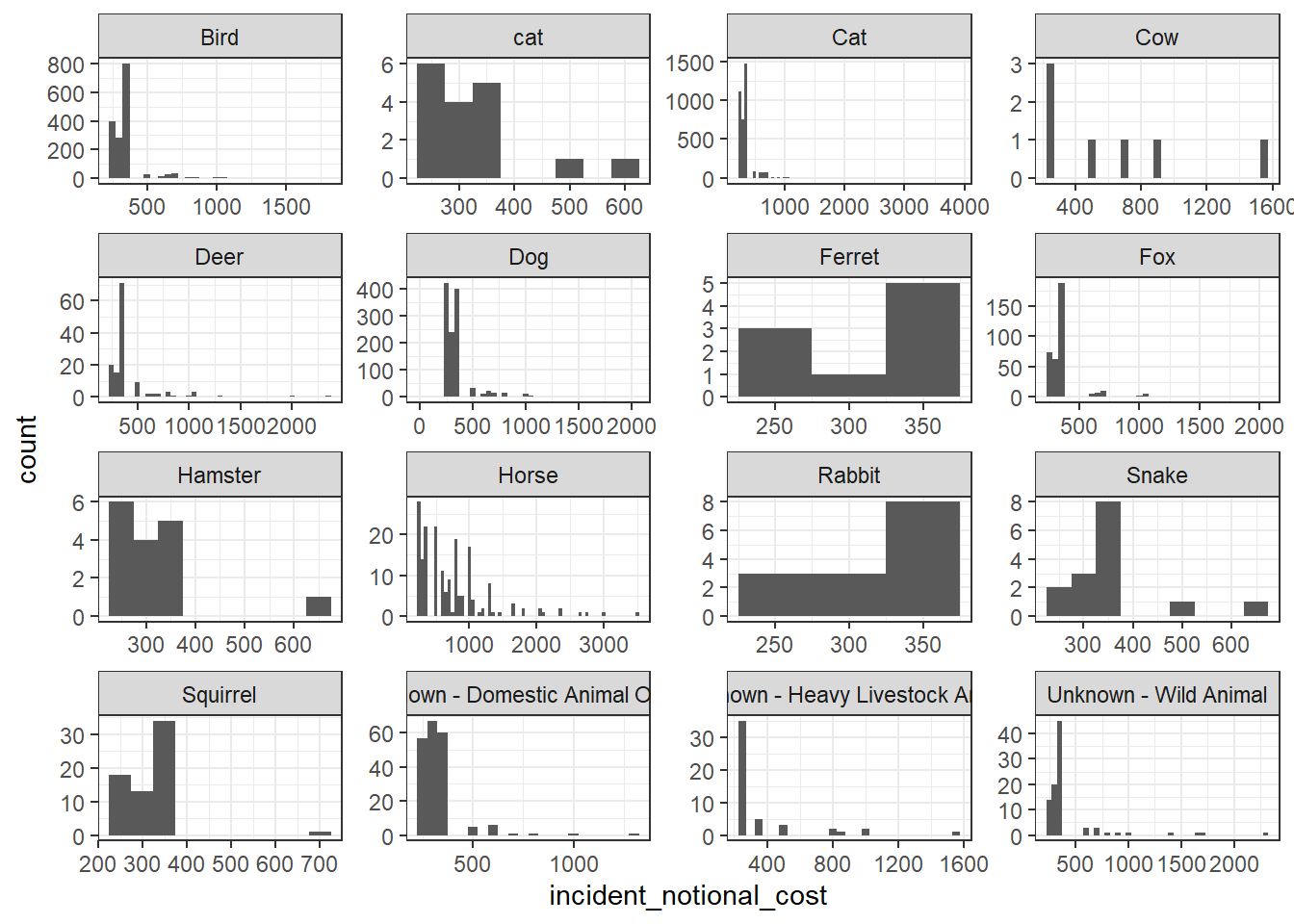
base_plot + geom_density()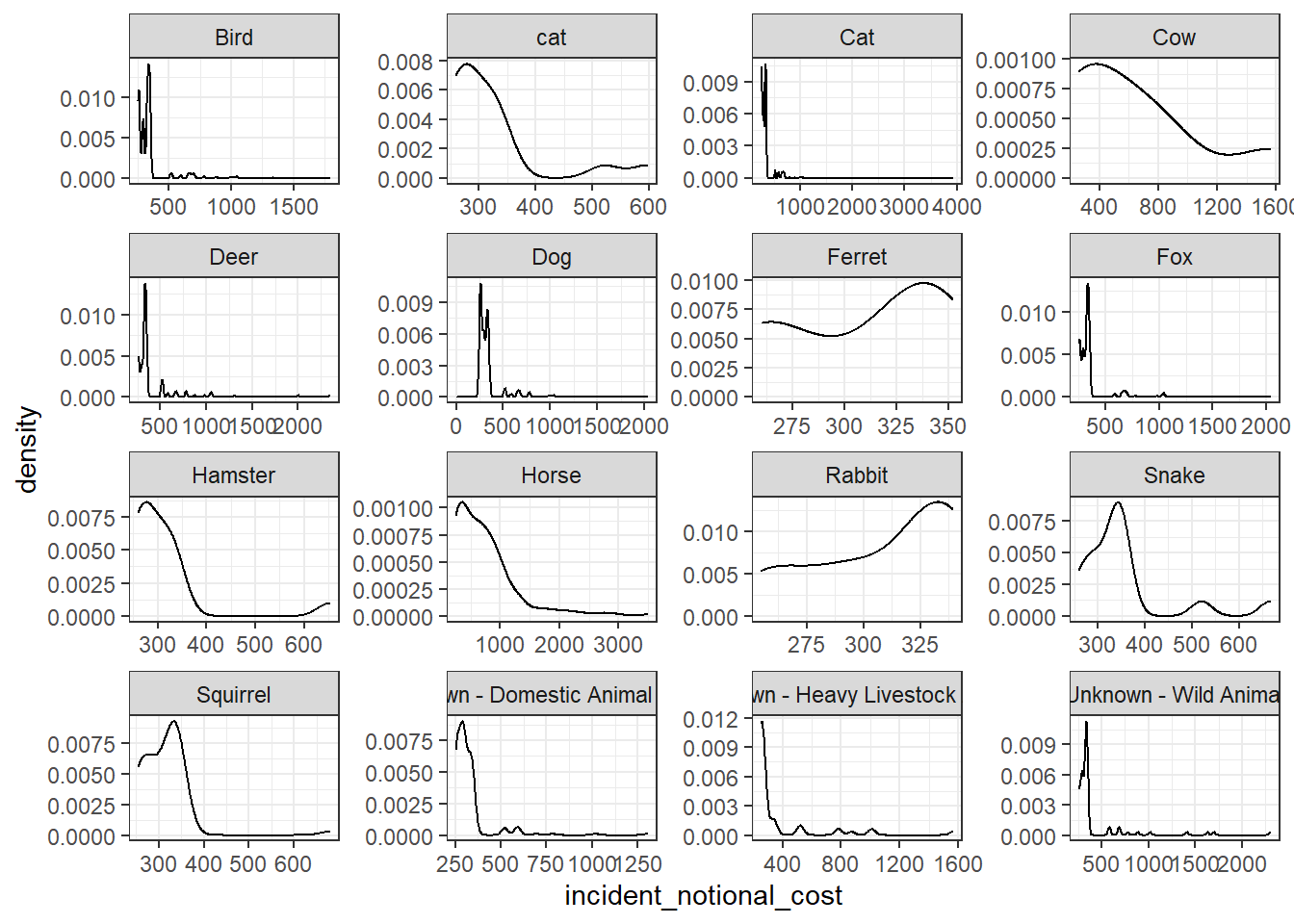
base_plot + geom_boxplot()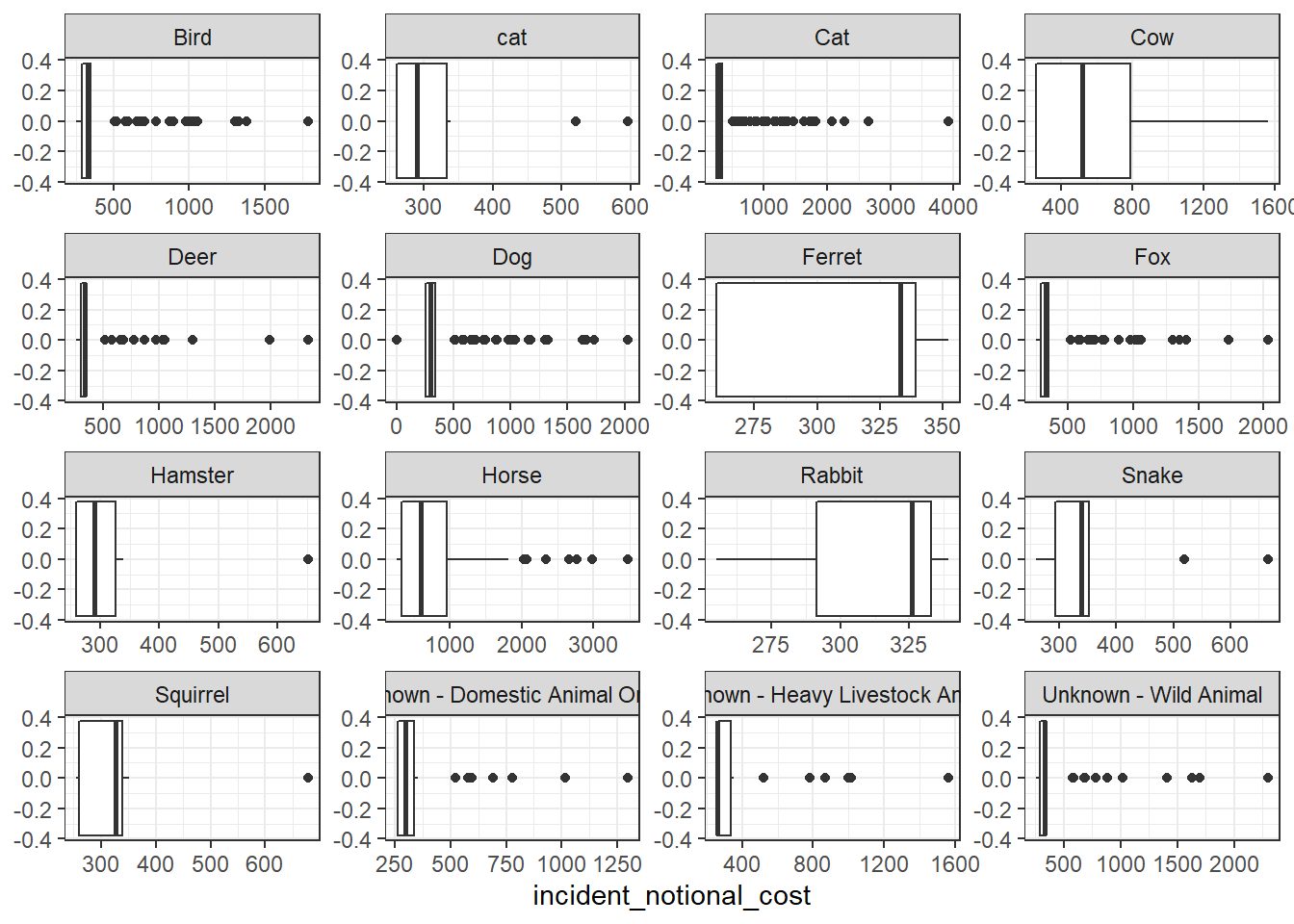
base_plot + stat_ecdf(geom = "step", pad = FALSE) +
  scale_y_continuous(labels = scales::percent)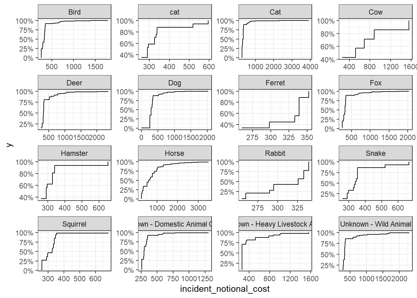
Which of these four graphs do you think best communicates the variability of the
incident_notional_costvalues? Also, can you please tell some sort of story (which animals are more expensive to rescue than others, the spread of values) and speculate about the differences in the patterns.
The density plot is the better of the four in communicating the variability of the incident_notional_cost values. Since the density plot directly gives the probability on any point of the graph, it is much easier to see than the histogram bands. However, even these density plots are not the best. Since the x-axes are not in the same scale. Therefore, they cannot be directly compared with each other. Many animals including rabbit and ferret do not even have records in higher rescuing costs over 350 pounds.
For horse and cow, it is easier to see that their rescuing costs spread over 800. Comparing with smaller animals, horse and cow are indeed the most expensive to rescue. This expensive pattern could be mostly attributed to the large size and heavy weight of horse and cow.
For small animals including rabbit, ferret, snake and squirrel, their records are more concentrated and usually smaller than 400. Therefore, these animals have less variability in rescuing costs. Such cheap costs would be attributed to the small size of such animals and more easy temper. When they are in danger, they would be relatively more cooperative to their rescuers and therefore result in less costs.
For heavy livestock and wild animals, they have more spread rescuing cost from 300 to over 2000. Even though their variability are not like those of cow and horse, they still have relatively higher variability comparing to smaller animals. This could be because of their wildness and large size. But, not all wild animals in danger would be discovered by human and reported to LFB for help. And not all livestock would be rescued by their owners because of monetary reasons. Thus, they have less variability in rescuing costs than horse and cow.
Submit the assignment
Knit the completed R Markdown file as an HTML document (use the “Knit” button at the top of the script editor window) and upload it to Canvas.
Details
If you want to, please answer the following
Who did you collaborate with:
only myself
Approximately how much time did you spend on this problem set:
16 to 17 hours approximately (including the installing time of R and all packages) Because of the Internet reasons, I spent around 5 hours exclusively in installing TinyTex package.
What, if anything, gave you the most trouble:
TinyTex mentioned before
Knitting HTML file. I was trying to include a picture in task 1 but I wrote wrong codes which are not recognized by RStudio. I spent 2 hours checking task 3 and task 4 because I thought the problem was there.
For LFB data, there are 52 parsing failures. They are not parsed correctly bacause the notional cost is actually null or 0. However, the parse function could only transform text-numbers into digits. I spent 2 hours looking for answers to avoid that warning. I tried to filter the NULL first and mutate them into 0 then parse all text-numbers into digits. For some unknown reasons I didn’t succeed.